An architecture diagram that shows business purpose
DDDing architecture diagrams
I have been analyzing and doing architecture diagrams since the very beginning of my career.
Most of them focused on the technologies being used and how they communicate with each other. Few of them share the business purpose.
How often did you need to speak with someone while looking at a diagram to ask what that service does? And that one?
In this post, I share an architecture diagram showing the elements' business purpose.
Domain anemic diagrams
In the following image, I illustrate a plausible diagram you might have in your company today.
I’m sure that, instead of having boxes with names as service A, you will have more human-readable names, and, if you are lucky enough, those names will be names related to the business, like users, billing, accounts, credit card, …
While looking at this diagram, could you tell:
Which service is core, and which one is supportive?
What does each service?
Why do they need to talk to each other?
Are they synchronous or asynchronous?
You need to know each technology being used between each service.
This diagram focuses on two things:
Information flow.
Technologies to support that information flow.
Why do we put that emphasis on the technologies being used and less on what do they solve?
Let’s start by adding meaning to the services.
DDDing the diagram
Domain-Driven Design shares that we have three types of Domains:
Core Domain: This is where you are making a strategic investment in a single, well-defined domain model, committing significant resources for carefully crafting your Ubiquitous Language in an explicit Bounded Context.
Supporting Subdomain: This modeling situation requires custom development because an off-the-shelf solution doesn’t exist.
Generic Subdomain: This kind of solution may be available off the shelf. You don’t want to make that kind of investment here.
Wouldn’t it be cool to notice each service's domain type in the diagram?
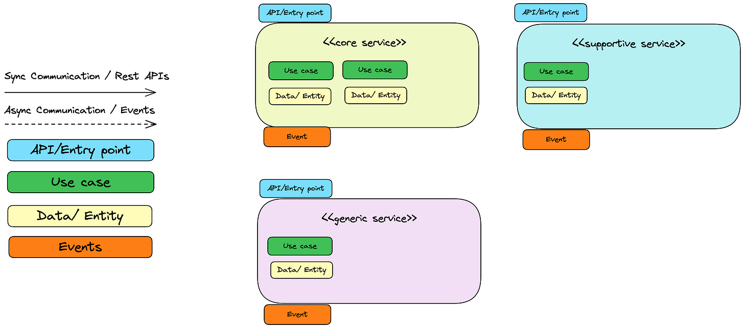
Adding colors of meaning
Suddenly, we can see which services are more critical than others. Which could tend to evolve faster than others.
But what do they do? Which are their use cases? Why do they talk with each other?
We need to have enough information to understand their use cases.
Adding boxes of business purpose
When I look at a diagram, I want to know:
Which are the main entities.
Which are the primary use cases.
How services can interact with them. Sync or async.
Which events do they emit, and which services listen to them.
To add this information to the diagram, we can use 4 primary boxes:
API/Entry points.
Use cases.
Entities.
Events.
And how they communicate can be marked either by solid (sync call) or dashed (async all) arrows.
Let’s see how our diagram could evolve with this information.
Now, we can look at the diagram and understand each service's responsibility and business purpose.
Here is the excalidraw I used.
Disclaimer
The diagram needs to show a high-level overview.
If we have too much information, it loses its purpose due to information overflow.
⚠️ I know that this diagram is not colorblind-friendly. Please, add notes in the diagram to be more inclusive to your colleagues.
Thank you a lot for reading this post 😄.
I love to read your feedback and opinions to help me improve. You can DM at my LinkedIn or just leave a comment using the following links:


